
New York City, originally uploaded by Tim and Trudy.
Such a pretty city. Art Deco really is my favourite type of architecture.
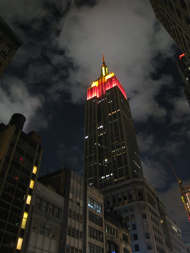
(my wife took this shot tonight on our Ixus 870IS)
New York City, originally uploaded by Tim and Trudy.
Such a pretty city. Art Deco really is my favourite type of architecture.
(my wife took this shot tonight on our Ixus 870IS)
About a month ago, while trying to upgrade to Windows 7, I managed to wipe the partition table and in trying to fix it, created a corrupted table.
(incidentally, if you can’t update Vista with the latest service pack, you won’t be able to upgrade to Windows 7, so don’t bother trying without fixing your boot configuration. Turns out my problem was having a dual-boot configuration with XP)
I had backed up my key files, but I wasn’t keen on losing my nice Vista configuration. I posted the whole sordid tale on Superuser.
Happily, I managed to figure out what had happened, what I was actually doing at a low level (sometimes I am a little too lazy and do just blindly run commands, something that Raymond Chen despises), and completely recover. I figured I’d post a link to the solution in case anyone else has their own troubles.
I realised tonight that there are quite a variety of tools and products I’ve been using lately that I’ve been really enjoying, including:
I live in Beacon Hill, where owning a car is both expensive and difficult. As such, I have two RFID cards in my wallet – my monthly MBTA pass and my Zipcard. Zipcar finally released their iPhone application, which although not as exciting as made out to be (no initial unlocking of the car from your phone, but I do enjoy surreptitiously honking the horn while my wife is driving), does provide a very convenient way of getting a car when you need it last minute. Their website is actually very nice too, and makes finding and booking a car surprisingly easy — I particularly like how they’ve implemented the calendaring. The car sharing itself is also great. $6.13/hour, all-inclusive, for a Prius just 2 blocks from my apartment is very compelling. The insurance setup is less than ideal (only state minimums), and it depends on the goodness of others to keep the car in decent condition, but I’ve had no serious problems as yet.
While I wait for TripAdvisor’s updated mobile offerings, I continue to enjoy using Yelp’s nifty local review app. I’ve used it to find things to do when in NYC, somewhere to grab a quick bite, bars I didn’t know about and even write reviews while still at a restaurant. The augmented reality is a nice toy, but a little gimmicky. I recently used Yelp when visiting Michigan, and used it to find local favourites like Bates burgers and Bode’s Corned Beef House.

This is a pretty amazing flight search tool, replacing calendar widgets with a Googlesque search box. Not officially launched yet, but looks like it will be pretty awesome when it does. Try searching for things like “Brisbane to snow in early December”.

I’m pretty sure I’m not the only person who hates waiting around an airport with no idea what’s going on with my flight. Flightcaster will tell you the chances of a delay well before the airlines will. So far I’ve been very impressed with both the prediction system and the UI, which is very intuitive and pretty. I had a pretty amazing experience with Flightcaster last week when flying to San Francisco from Boston. Before I left, the flight was listed as on-time, while Flightcaster predicted it was “probably delayed”. I arrived at the airport, and the flight was delayed by two hours, due to weather at SFO. While waiting, I checked Flightcaster again and it predicted we would be leaving shortly, and within minutes an announcement came through that the two hour delay had been shortened to a 20 minute delay. Nifty.

I know the iPhone 3GS has been out for a while, and it’s hardly groundbreaking to proclaim how great iPhones are, but since upgrading from my 2G to the 3GS, I’ve been pleasantly surprised at what a difference it makes. It’s now fast enough that I’m able to work remotely, it’s great having a longer battery life, and the difference the speed makes to the user experience cannot be understated. I particularly like the improved camera and finally having GPS and a compass, great for when I exit a T stop in a bewildered fashion.

A while back I wrote an article about using an iPhone as a home phone using Fring. Sadly, it was a little too buggy for everyday use, and I continue to use my dedicated Netgear phone. Happily Skype released an official iPhone app, which does everything I’ve always wanted in a dedicated Skype phone (unlike the disastrous Belkin Skype wifi phone). While it doesn’t work in the background, or over 3G (yet), it does give me access to IM and voicemail at all times, and I can use Skype-To-Go to make calls over AT&T. It also makes a great second landline at home while my wife is using our Netgear.

Today I got an email from an Australian company and noticed two things at the bottom of their email. The first was the ever-silly “Go Green – please consider the environment before printing this e-mail.” line.
Does putting this in actually make people reconsider printing an email? I wonder who started this trait? I suspect it was started with somewhat passive-aggressive intent somewhere where a lot of “technically unsavvy” folks were printing emails, and spread from there. It also wouldn’t surprise me if this is the net result most of the time:

(By the way, I really liked the way Google knew exactly what I meant when I searched for [reddit print email irony])
The second thing I noticed, and this is something I’ve definitely seen a lot more of from Australian companies for some reason, was the legal disclaimer.
I’m sure most people have seen this. It’s something like:
“This email and any files transmitted with it are confidential and intended solely for the use of the individual or entity to whom they are addressed. If you have received this email in error please notify the system manager. This message contains confidential information and is intended only for the individual named. If you are not the named addressee you should not disseminate, distribute or copy this e-mail. Please notify the sender immediately by e-mail if you have received this e-mail by mistake and delete this e-mail from your system. If you are not the intended recipient you are notified that disclosing, copying, distributing or taking any action in reliance on the contents of this information is strictly prohibited.”
They’re all ridiculously long, nobody reads them, and they break up email conversations in an annoying way. So why do so many people have them (with whole websites devoted to them)?
At first it seems reasonable to believe they do offer some legal protection, which would explain their popularity. But do they? I think it would be reasonable to think that if they offered iron-clad legal protection everyone would have them, yet I rarely see them attached to emails from US companies, perceived as one of the most litigious countries worldwide. Even said website devoted to them, EmailDisclaimers.com says:
If you were to be so unlucky to be sued for the contents of an e-mail, it is not certain whether an email disclaimer will protect you from liability in a court of law.
I’m certainly not the first to question this. Nor am I the first to think the content is generally ridiculous. Slate has also covered the issue. So given its dubious nature, I suspect it persists mainly as a way to reassure the company, without actually doing anything (just like the raptor-repellent I keep in my cube, just in case).
It’s trite, but it’s true – the best products to build are those that people want. Sage words from Paul Graham, yet I’m always surprised at how many products out there are solutions looking for problems. That’s why I was particularly pleased to see my good friend Andrew Goldstiver’s new startup, Sprixi — a site for finding useful images.
But what are “useful” images? First let’s consider the state of image search currently. Firstly, good image search matters a lot to people, as made clear by the positive reception of Bing image search after years of Google image search languishing. But what are the common use cases for image search? Trying to show someone something you don’t have a picture of (“Here Steve, this is what a Huntsman spider looks like in Australia”)? Trying to confirm what something looks like (“Ahh, so that’s what a Darwin stubby is”)? Looking for something to use for a blog post or an assignment (“Where do I find a picture of a periodontal probe“)?
It’s the last use case that’s always been frustrating. While writing my thesis I remember emailing dozens of people for permission to use their images. Then there’s the size issues – most images online are thumbnails, with few print quality images – without using filters these are difficult to surface. Finally, there’s relevance — finding the best image can be a chore.
So how to solve that? Sprixi does this a few different ways:
1. Great interface. Much slicker to use than other image search engines.
2. Fair-use image crawling. Sprixi aggregates all the best sources of images which can be re-used.
3. User contributed content. Users can upload their own images.
4. Crowd-sourced relevance. While images have a built-in relevance, Sprixi allows users to score photos so that the most representative photo floats to the top of the list.
5. Web 3.0 – like many new sites, Sprixi is part of the semantic web, by having an understanding of different concepts (also see Adioso and Trovix for other examples).

Sprixi learning a new topic

Rating an image

Using an image - notice the "choose" link on the left
As an example, let’s say I’m doing a presentation on user research, perhaps the ethnographic dental studies I completed for my thesis. If I need a generic picture of a dentist to illustrate a slide, I simply search for “dentist” on Sprixi. There’s an existing topic with sorted and unsorted images. I can then browse through the photos, rate them myself, and when I find one I like, I choose the size and click the “use” button (which is some very innovative use of horizontal real-estate for those of us on small screens), giving me the option to download or embed a link. If Sprixi doesn’t understand the topic you’re search for it will create a pool of photos based on aggregation on the fly.
As a later engaged member of the community, I could also upload a copy of any photos of dentists I took as part of my studies for other people to use. I could then populate a new concept, such as “participatory design” with some shots of researchers interacting with practitioners. Now suddenly there is a site which has useful pictures of the participatory design process. Trying this search on Google, Bing and Flickr revealed reasonable results, but with lots of cruft. Sprixi wants to get rid of the cruft. According to Andrew, it’s not explicitly necessary to rate images manually either, as Sprixi does some implicit rating through site interaction.
I was a little disappointed that Sprixi didn’t pick up on more obscure topics (e.g. periodontal probes) with its aggregation, but I’m sure this will continue to improve. Managing contributions (and the sign-up process in general) seems to be a work in progress.
I do wonder how big the user base for a product like this will be — however there are an awful lot of bloggers, uni students and Powerpoint presentation creators out there. I am still interested to see how Sprixi plans to monetize and grow beyond the few sites its crawling at the moment. If it gets traction though it could easily become a fantastic repository for free-use images.
Give Sprixi a try and let Andrew know what you think.
At first I thought it was just me who noticed how poor Google has been lately, but happily some folks from Hacker News confirmed I wasn’t going crazy. Today I had an odd query which got me suitably terrible results.
I was writing an email and wrote as part of my sentence “based on recency”, and Outlook (really Word) underlined it to indicate a spelling error. I felt sure that “recency” was a real word (and as I type this, Firefox keeps insisting it does not exist either), so I ran a Google search for [recency microsoft word misspelled]. Note that I put Microsoft in there to ensure I would get back results that talked about Microsoft Word and not the word recency in general. Anyway, the first result I got back was this:

So not only has it changed my search from recency to Regency, without actually asking me, it also changed the stemming from misspelled to misspellings. I wondered if it would also start dropping terms from my search which drives me crazy, and was one of the original reasons I switched from Altavista to Google. Sure enough, results 6 and 8 were both missing “recency”, the thing I was most interested about.

Yes Google, you do make it easier for people who aren’t savvy, but can you at least give me an account flag to not have you mess with my results? I had at least 7 fantastic years, and my more mundane queries still work fine, but more and more I find myself frustrated. One last example, which I’ve come across a few times. I heard something about a campaign at The University of Queensland called “Bring back the Red Room”, which was the university bar while I was studying there. Wondering if it’d been shut down and what the story was, I ran an appropriate search:

Why is the first link something that doesn’t even mention the Red Room? Neither link provides any useful information to the query at hand. Here’s where it got interesting – when I was typing a new query, [red room], it automatically suggested [red room st lucia]. Clicking on this returned this:

…answering the question about what happened while still in the search results. So why such a difference in results?
The problem is essentially that Google is becoming a tool for people to find destination sites, rather than information. I am guessing that the majority of users of Google actually do find this useful, but it is alienating a core component of the Google faithful, creating a potential opening in the search engine market. I look forward to seeing what might come of it.
One thing has always puzzled me — is Craigslist successful because of its simplicity? Or is it because it was first?
I’ve heard the “you can’t be successful unless you’re first” line bandied about a few times, but have never truly believed it. It was a reason given why not to create a social networking component on Trovix, which I argued against with the example of Facebook versus Myspace, or Google versus Yahoo. Based on examples with sites that big (and examples of smaller companies continuing to thrive in a niche, such as Vimeo versus YouTube) I’ve always believed that a superior product and/or a compelling value proposition are key ingredients to a product’s success, and while some inertia can be gained from being first (particularly with network effects), it is not insurmountable with appropriate marketing (which is why Trovix now has a social networking component).
But what surprised me today was seeing the success of eBay’s kijiji in Canada. A hat tip to kitcar for the link.

Red line is kijiji and blue line is Craigslist.
In Canada, Craigslist was slow to take off. As such eBay put serious effort into marketing to gain that all important network effect, and now Craigslist is slowly becoming irrelevant. The most amazing part is seeing the actual moment the network effect takes hold in late 2007. If Craigslist was like other companies, they would do what eBay in Australia did. Back in the late 90s, eBay was king in the US. However in Australia, some local imitators jumped in, including sold.com.au (which now redirects to ebay). All of these were handily beating eBay, until a well-coordinated marketing campaign put eBay back in front. They weren’t as effective in New Zealand though:

Blue line is trademe.co.nz, red line is eBay.co.nz (insufficient traffic to appear on the graph).
The final thing worth noting is that kijiji does in fact have a foothold in the US. If growth continues (currently a healthy 10% per month compared to 4% for Craigslist) and Craigslist remains stagnant, it’s hard to imagine, but they could eventually win out:

Red line is craigslist and blue line is kijiji.
There’s a very good example of this sort of slow growth playing out right now with Gmail and the other webmail providers. It’s slow, but it’s seemingly inevitable that Gmail will be the number one email provider:

Gmail is the orange line, bright blue is AOL and dark blue is Hotmail.
So – back to the original question. Is it better to have a feature rich site or a more usable but limited site? There’s unfortunately no easy answer — it all comes down to whether users who want to use your site can get done what they want to get done. Craigslist has been “good enough” for a long time, and inertia continues to carry them. However given enough incentive (a site with better features and just enough of an audience to make it worth your while) users can and will swap. It’ll be interesting to see how kijiji continues to fare in coming years.
One important usability principle is to manage complexity for the user. This means both the UI itself, and contraining the data to prevent overload. Brandon Walkin wrote a nice article about managing complex UIs, but didn’t talk about managing complex data.
Usually Google does a great job in this field. Their onebox concept allows them to float up what they think will be most relevant to you in a small snippet. If they want to give you extra results, they just give you a few and clearly delineate the rest of your results. Google Finance does a really nice job of different zoom levels of data:

and when zoomed out:

It’s hard to tell the difference — which is deliberate. Google put in some very nice smoothing algorithms as well as doing a decent job on adjusting the scale and news for the stock.
One thing that has surprised me is the increasing complexity to Google Maps. I’m not sure why they keep adding unverified user submitted datas and non-relevant photos, but they do. Now they provide so much information it’s essentially unusable:

I’ve also noticed lately that if I search for a particular destination, I usually get a large cluster of destination points, as well as an arrow actually pointing to my location (example below is of Massachusetts State House).

The top x data points is usually a good rule of thumb (depending on the size of the display between 10 and 25), or just show 1 if there is a high degree of confidence. I think Yelp does a pretty nice job with their map – giving you the option of retaining the original data, or updating the top 10, which keeps it nicely manageable.
I thought this was a very literal (and ugly) choice for an icon, care of my247.com.au (why are there no decent Australian review sites?)

Incidentally, Gelateria Cremona has what is easily the best gelato I’ve ever had. I can only imagine how popular they would be in San Francisco…
One thing you can say about Google is its search results page has been known for its consistency and simplicity. The most radical addition was the poorly-received (by bloggers anyway) search wiki. Most changes have been behind the scenes — there has been a lot of additional complexity being continually added to the html source over the years, and plenty of tweaks with how the results are presented, their ordering, and the OneBox. Google had their unbranded playground, SearchMash, which recently was decommissioned, and they also bucket-tested very select features, but very little actually changed on Google.com. The site is certainly different to how it was 5 years ago, but it has been so gradual, it’s like watching someone you know age. If you look at a photo you can see the difference, but otherwise they look the same.
I’m not sure if it’s a direct response to the Microsoft/Yahoo partnership, but in the past few weeks Google appears to be taking broad steps towards changes that now benefit them rather than the consumer, while also pushing out new features. There was the recently revealed Caffeine, creating a strong connection between new features and the Google brand. They recently changed the landing page for Google.com, when signed into a Google account so that it defaults to iGoogle rather than the vanilla search page (giving me yet another location to have an unattended chat window open). The latter is most definitely an attempt by Google to keep users within their sites and expose them to new products (currently Google Latitude and Calendar are featured prominently on mine, even though I had previously customised iGoogle). Now Google have rolled out some tweaks to their search result page (which I am pretty sure are not being bucket-tested, as I’m sure I saw them tested a couple of years (!!) ago):

Click for a larger view
On the left in the red box is something I’m very surprised to see from Google and I was just thinking about the other week. Filters! Filters are a surprisingly difficult usability problem, and something I’ve spent a lot of time on. I’m pleased to see Google has put them on the left (something I believe is more natural to the user), and it’s also good to see they start minimized, but are still noticeable enough so that when you need them they are there. In this example, I was keen to see more timely details about the AT&T iPhone tethering, and was about to adjust my query when I noticed the filter box and was able to simply ask for results in the last week.
The green box on the right is a relatively subtle change. My guess is that given the prevalence of wide-screen monitors these days, the clicks on the ads were trending downwards (or perhaps their gaze-tracking machine noticed less eyeballs). As such they have brought the ads to come sit right next to your results.
However, the fact is that neither of these would be that interesting on any other site. My original title for this entry was “Google doesn’t stop innovating”, but Google has a tried and true formula, and I think it’s far more accurate to say that they are relentless iterators (at least when it comes to the UI). Now, if only they would implement the custom re-ordering of the navigation bar based on usage that I suggested to them…

